Importance of Typography in Graphic Design
Share

It includes choosing fonts, spacing, line length, and alignment. Typography is not just about pretty fonts; it creates a visual order that guides readers.
This art affects how we understand written information. Different styles can create different feelings. For example, serif fonts suggest tradition, while sans-serif fonts feel more modern.
Choosing the right typography affects how easy it is to read. A good typographic layout ensures clarity and keeps people engaged. In summary, typography is essential for good communication in design.
The Importance of Typography in Graphic Design
It is an unsung hero in design. While images catch eyes, fonts shape the message’s impact. Whether it’s for a logo, ad, or website, typography influences how people feel about your brand.
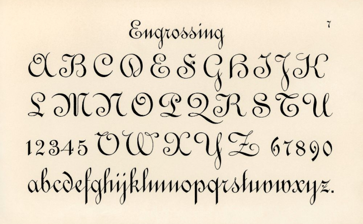
Think of an inspiring quote in fancy script versus bold sans-serif—each creates a unique vibe. Typography isn’t just about looks; it improves readability and expresses emotion.
Typography does more than decorate text—it ensures your message is easy to read. A well-chosen font can guide your audience’s attention and make the content memorable. Bad typography, on the other hand, can confuse or even push people away.
Different fonts suit different purposes. For example, serif fonts feel formal and trustworthy, while sans-serif ones feel modern and friendly. Choosing the right font is like picking the perfect tone of voice—it tells readers how to feel and respond.
The Role of Typography in Graphic Design
Typography is the visual voice of design. It shows emotion, sets the mood, and creates structure in layouts. The right font can instantly improve the look of a project and shape how people perceive it. Take advantage of our animation and motion design training to become a true professional.
Using it well helps guide readers through content. Different fonts highlight important parts. Bold text can spark curiosity, while soft fonts feel calming. Clear font choices make messages more memorable and engaging.
It also makes reading easier. A good font ensures text is clear on all platforms and devices, keeping readers engaged. Consistent typography builds trust and reinforces brand identity.
Text and images need to work together. Typography adds balance to graphics, creating harmony in designs. When aligned well, both elements strengthen the message and enhance user experience.
Good typography makes designs stand out and stay in people’s minds. It turns ordinary visuals into meaningful and lasting impressions.
The Elements of Type
Typography is made up of key elements that shape its style and impact. The first element is the typeface, such as serif or sans-serif, with each bringing a distinct mood. Serif fonts feel formal and traditional, while sans-serif fonts are modern and approachable.
Font size is another crucial factor. It influences both readability and how information is structured. Large fonts grab attention for headlines, while smaller fonts work well for body text to convey supporting details subtly.
Line spacing, or leading, affects how smoothly readers move through text. If the lines are too close, the text feels cramped, making it hard to read. Proper spacing ensures clarity and keeps readers comfortable.
Letter-spacing, or tracking, adds personality to a text. Increasing or decreasing the space between letters changes the tone. Tight tracking makes text feel bold and compact, while wider spacing creates an airy and elegant feel. Discover graphic design courses in Bengalore.
Color is also essential in typography. It sets the mood, directs focus, and highlights important details. For example, bright colors can create energy, while softer tones bring calmness and warmth to the design.
Every element works together to shape the overall message and look of the design. When used correctly, it improves both aesthetics and functionality, making the content more engaging. These small decisions, like choosing the right typeface or adjusting line spacing, contribute to effective visual storytelling.
How Typog Affects Branding and Marketing
It plays a key role in shaping how people see your brand. The right font shows your brand’s personality and values. A bold font can feel powerful, while elegant script brings a sense of sophistication.
When customers interact with your brand, typography affects their emotions. It sets the tone of your message, creating a mood that builds trust and recognition.
Using the same typography across all marketing materials strengthens brand identity. Consistency makes your brand familiar and easier for people to remember.
Typography also affects how easy your content is to read. Clear, readable fonts encourage people to engage with your message.
Effective typography connects design and communication, helping brands stand out while delivering messages that leave lasting impressions. What are the best graphic design schools.
Typography is essential in graphic design course in Mumbai. It’s more than picking fonts—it creates visual harmony and improves communication. The right type grabs attention, expresses emotion, and strengthens a brand’s identity.
Whether for print or digital media, understanding typography can enhance your designs. It brings balance and ensures your message is clear. Good typography guides the viewer’s eye without feeling overwhelming.


